

Giving Aged Care facilities clarity during Australia’s largest funding reform
Supporting 60,000+ residential aged-care beds through the national shift to AN-ACC.
The challenge facing aged-care facilities
Context
In response to the Royal Commission, the Australian Government enacted a major policy change, replacing the Aged Care Funding Instrument (ACFI) with the Australian National Aged Care Classification (AN-ACC). This funding shift represented a critical moment for providers, demanding they adapt quickly to understand new funding outcomes, gather accurate evidence, and mitigate significant compliance risk during the transition.
Clinical Manager, Telstra Health’s aged-care platform, is relied upon by facilities covering over 60,000 residential beds. Its established ACFI workflows were incompatible with the AN-ACC model. Clinical and clerical staff urgently needed clarity, predictable workflows, and confidence ahead of mandatory government assessments.
As the Senior UX Designer, I was responsible for leading the end-to-end UX work—designing a new, resident-centred assessment experience aligned with the complex AN-ACC structure. This required translating regulatory rules into a cohesive workflow, guided by deep user insight and shaped around the high-stakes needs of nursing and administrative staff.
Project scope
Role
Senior UX Designer
Timeline
6 Months
Company
Telstra Health, Age Care
Focus
Implementing AN-ACC in Clinical Manager
Problem
Aged Care facilities needed a reliable, structured way to understand AN-ACC funding outcomes and collect evidence that would withstand rigorous government audits and assessor reviews. The legacy ACFI workflow did not map to the new model, and attempting to retrofit it was deemed a strategic risk due to potential errors and confusion.
Key challenges included:
High Staff Anxiety: Fear among clerical staff of revenue loss due to misclassification.
Assessment Risk: Concern that independent government assessors could misinterpret resident needs without clear supporting evidence.
Evidence Scarcity: Difficulty finding and linking supporting clinical evidence across multiple, disparate parts of the existing system.
Cognitive Load: Legacy interface with unclear terminology and inconsistent UI patterns increasing the burden on staff.
Lack of Validation: No mechanism to preview or validate potential AN-ACC outcomes before official assessment.
The primary requirement was a clear, linear workflow that made evidence capture easy, transparent, and defensible, tying directly to each component of the national assessment.
Funding reform and design implications
From ACFI to AN-ACC: The Strategic Shift
The move from ACFI to AN-ACC fundamentally changed the mechanisms of funding calculation and who controls the assessment process, introducing a high degree of operational and financial risk for providers.
For providers, this reform was not merely a new formula; it was a loss of perceived control over revenue and a significantly higher bar for documentation and transparency.
| Feature | Legacy ACFI Model | New AN-ACC Model |
|---|---|---|
| Assessment Authority | Facilities completed their own assessments. | Independent government assessors classify the resident. |
| Funding Transparency | Internal "quick calculators" helped estimate funding. | Funding is tied to a standardised national assessment tool (less internal control). |
| Evidence Requirement | Evidence was often scattered across documents and notes. | Evidence must be clear, traceable, and defensible for audit. |
| Provider Control | High perceived control; potential for "resident shopping" to optimise revenue. | Significantly reduced control for providers, resulting in high anxiety about outcomes. |
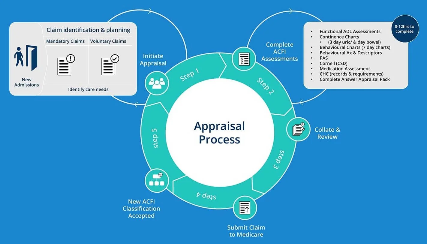
The ACFI assessment process undertaken by individual providers
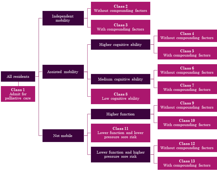
AN-ACC Classifications undertaken by outside assessors
Can we adapt current workflows?
Before recommending a redesign, I explored whether the existing ACFI workflow could be adapted for AN-ACC. Reuse would have been faster to deliver, easier for development, and less disruptive for staff.
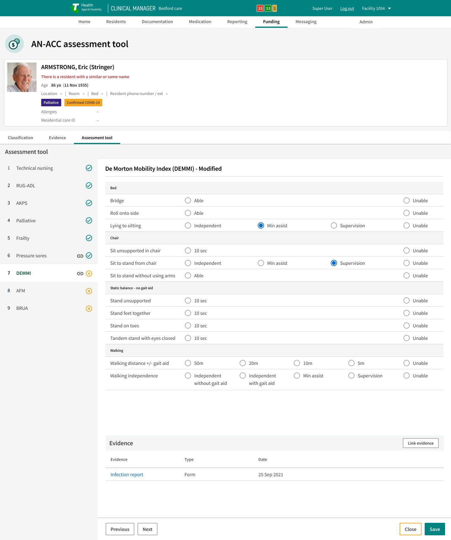
AN-ACC Assessment Criteria
Technical Nursing Requirements
Resource Utilisation Groups & Activities of Daily Living (RUG-ADL)
Australia-modified Karnofsky Performance Status (AKPS)
Palliative Care
Frailty
Braden Scale for Predicting Pressure Sore Risk
De Moreton Mobility Index (DEMMI) - Modified
Australian Functional Measure (AFM)
Behaviour Resource Utilisation Assessment (BRUA)
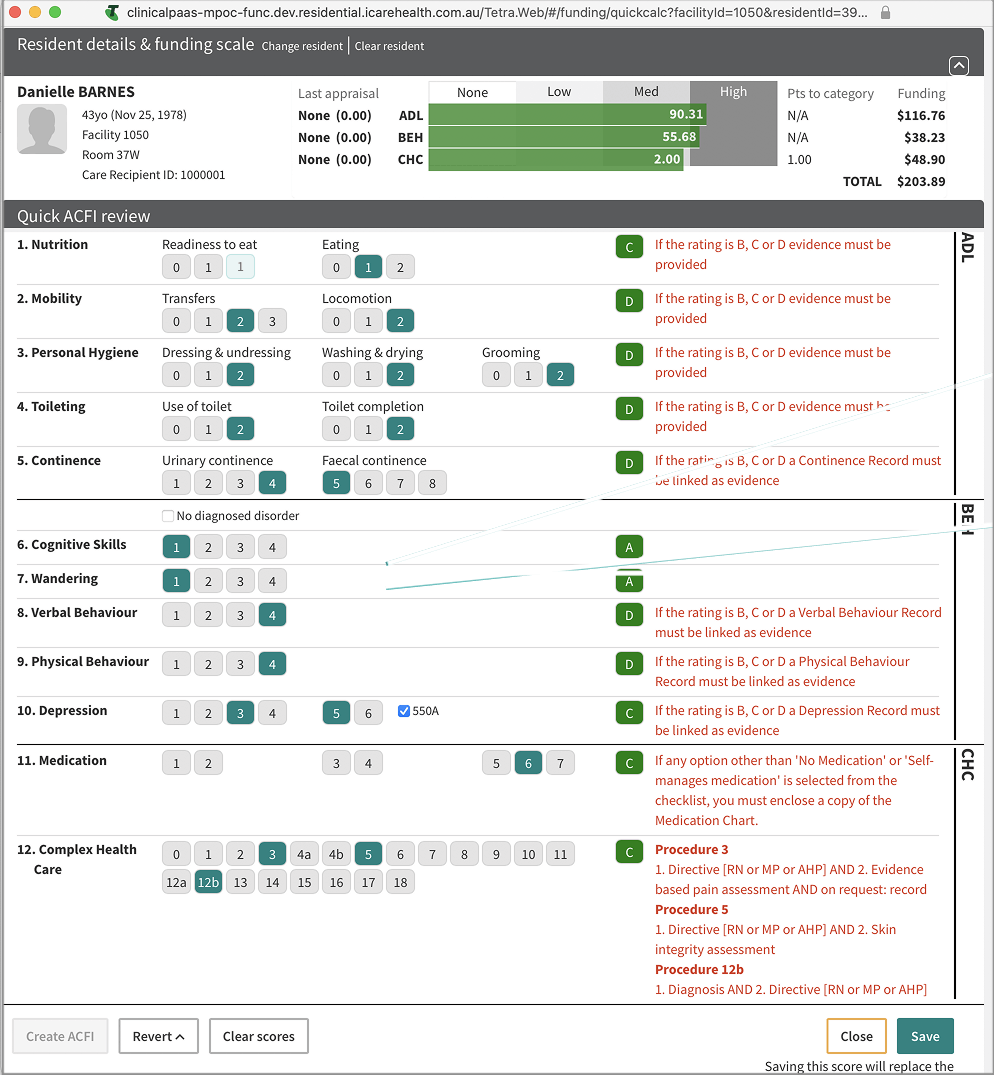
Old ACFI funding calculator in Clinical Manager
After analysing both models and walking through the current ACFI workflow, I found that:
AN-ACC domains do not map cleanly to ACFI
Scoring logic is different
Evidence expectations are more structured
Retrofitting would increase complexity rather than reduce it
Based on this analysis, a targeted redesign became the clearer, safer option.
What this meant for Clinical Manager
These strategic changes dictated specific, non-negotiable requirements for the Clinical Manager platform and its user experience:
The UX needed to offer staff a way to understand likely AN-ACC outcomes before the assessor visit to mitigate financial risk.
Evidence linking had to be simple and contextual to facilitate audit readiness.
The system needed to reduce staff anxiety by presenting a clear, predictable, and stepwise process.
Old ACFI workflows and calculators were fundamentally incompatible and could not be repurposed.
The design had to simultaneously support compliant day-to-day clinical documentation and funding preparation.
The design response was anchored in building a resident-centred assessment flow that precisely mirrored the structure of the AN-ACC tool, giving facilities superior visibility of their collected evidence and potential funding risk.
What staff needed to feel supported

Research and insights
I conducted interviews with clerical and clinical staff from five residential aged-care facilities. Their concerns were consistent, highlighting the emotional weight of the transition and dictating the necessary design guardrails:
Anxiety about Misclassification: Fear of financial impact due to errors in the system.
Complexity: Confusion around new AN-ACC requirements and government terminology.
Findability: Difficulty locating and cross-referencing clinical evidence in the legacy system.
Predictability: Strong desire for predictable, linear assessment sequences to ensure completeness.
Key design principles derived from research:
Evidence Accessibility: Evidence must be easy to find and link in context of the assessment question.
Predictable Flow: The assessment must flow in a clear, expected sequence to mitigate anxiety.
Terminology Alignment: System labels must match the language used by staff on the floor.
Reduced Load: Layout must be simplified and consistent to reduce cognitive load.
System Integrity: Repurposing ACFI screens would create high functional and technical risk.
Synthesised insights across four facilities revealed a critical need for structural reassurance and simplified evidence linkage.
Design strategy
The strategy centered on creating a safe, predictable assessment experience and laying a foundation for future system evolution, all within significant legacy system constraints:
Alignment: Align the user flow directly with the government's AN-ACC assessment structure.
Embedded Tools: Build evidence-tagging functionality directly into each step of the workflow.
Consistency: Employ consistent, modern layout patterns across all screens to reduce cognitive load.
Validation: Validate the direction with clerical and clinical users through rapid, iterative testing.
Interpretation: Work closely with Business Analysts (BAs) to interpret complex government scoring logic and integrate it reliably.
Design decisions and iteration
Key design decisions
| Decision | Explanation |
|---|---|
| A structured assessment flow | A linear, step-by-step flow that mirrors the AN-ACC structure was implemented to reduce staff confusion and provide a clear sense of progress and completeness. |
| Evidence tagging | Staff can securely attach documents, notes, or observations directly to specific assessment questions, making evidence retrieval for auditors traceable and defensible. |
| Consistent hierarchy | Layouts were drastically simplified to reduce cognitive load, improve scanning, and prevent disorientation (navigation jumps) across different assessment components. |
| Embedded progress notes | Users can add contextual notes and observations without leaving the primary workflow, improving data integrity and reducing task switching. |
| Terminology alignment | Labels were comprehensively updated to mirror the precise language used in aged care facilities, improving adoption and reducing ambiguity. |
Testing and iteration
Iterative testing with target clerical users was crucial and revealed clear expectations around reassurance and transparency:
Users needed constant reassurance about their current position within the complex workflow.
Evidence status had to be visible in context—not hidden behind secondary screens.
Navigation structure had to be predictable and stable across the entire assessment.
Key Iterations Included:
Refining the evidence tagging workflow to be one-click and less disruptive.
Improving visual hierarchy to ensure navigation stability and prevent perceptual 'jumps'.
Strengthening visual cues and a persistent progress tracker for status visibility.
The linear flow provides staff with a predictable path, reducing anxiety about missing critical data points for the assessor.
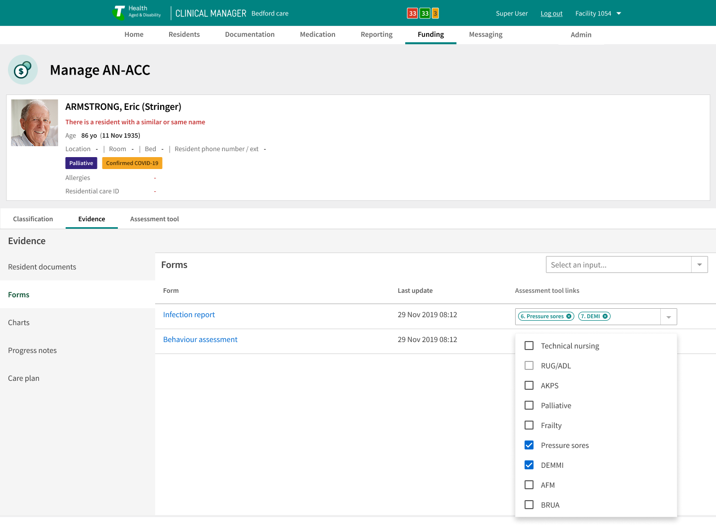
The evidence tagging workflow securely links clinical records to the assessment, creating a clear audit trail.
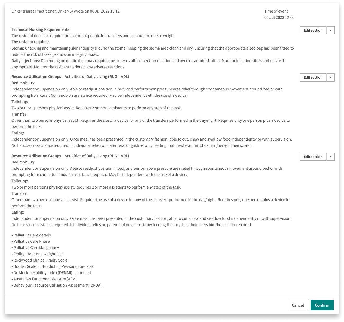
Embedded progress notes allow for immediate context capture.
Analysis of work delivered
Impact
The successful implementation prepared facilities using Clinical Manager for the national funding shift, delivering clear, measurable outcomes:
Improved Accuracy in AN-ACC assessment preparation, de-risking financial loss for providers.
Reduced Anxiety for clerical and clinical staff by providing a predictable, structured system.
Stronger Evidence Capture capability, significantly increasing audit readiness and defensibility.
Readiness Across 60,000+ Residential Beds, ensuring business continuity for a major portion of the aged-care sector.
Reinforced Clinical Manager’s Leadership Position as the trusted, compliant platform during a period of intense regulatory change.
My Role
As the Senior UX Designer leading the project, driving both hands-on design and strategic alignment:
| Core contribution | Deliverable |
|---|---|
| Research synthesis | Defined the project's UX Roadmap and established the core design principles based on user needs. |
| Workflow design | Functioned as the User Advocate, translating complex government rules and clinical intent into clear, reliable user flows. |
| Component architecture | Established the foundational design patterns and component architecture used for the new assessment suite. |
| Cross-functional leadership | Negotiated technical and scope trade-offs with Engineering and BAs to ensure incremental, high-value delivery within legacy constraints. |
| Prototyping & iteration | Led iterative testing and decision-making on final design delivery and visual hierarchy. |
Key statistics
< 2 min evidence lookup
Reduced from 6–10 minutes
+38% confidence
Staff preparing AN-ACC assessments.
Clear audit-ready assessment trail
All the evidence found in context
90% ease-of-use rating
“The UX is really impressive!” - Scalabrini
Half the navigation steps
Single assessment screen, down from 4–5 disconnected screens
Completeness & accuracy
Fewer follow-up corrections across all five facilities.
Reflection
This project demanded rigorous clear prioritisation and disciplined decision-making under an accelerated timeline. The constraints of the legacy system and the high financial stakes of the reform shaped every stage. By grounding the workflow firmly in both user insight and the government's AN-ACC structure, we delivered a safer, clearer assessment experience that successfully prepared providers for the funding transition.
The project underscored the critical importance of establishing foundational component architecture that could serve as the template for future AN-ACC aligned features, proving the viability of modern design patterns while delivering meaningful, system-level value immediately.
Clinical manager AN-ACC Assessment tool